The Problem
The rise of the mobile web over the last half decade or so has meant that our website testing, that once, not that long ago, generally involved 3 or 4 browsers across 3 or 4 operating system versions, has now grown to a hand-full of browsers, spread countless operating system versions all running on what seems like infinite hardware variations. To top it all off these OS versions run on devices of all shapes and sizes adding another dimension to the puzzle.
According to OpenSignal’s Android Fragmentation Report there are close to 19,000 ‘distinct Android devices’ in circulation in 2014. That’s a lot of devices to get hold of and test on.
Let’s be honest, our coverage of all these is impossible, we’re never going to be able to cover all the bases. To do so we would need an army of testers, never mind the bulging bank account needed to purchase them all.
What is Device Emulation?
Device Emulation allows us to emulate specific aspects of a device without having to own that hardware. Chrome’s Developer Tools now features a “Device Mode” which offers us a huge variety of tools for emulating specific devices and simulating the physical hardware sensors that aren’t possible on our development machines. This device emulation includes things like user-agent spoofing, exact screen dimensions and pixel density. From the hardware side we can now emulate geolocation and accelerometer data along with throttling network speeds to better recreate real world situations when users are out and about.
Device Mode - The Basics
To access the Device Mode we simply open up Chrome’s Developer Tools (CMD-ALT-I) and then click the mobile phone icon at the top left. This will put our browser window into an unfamiliar state with rulers and grids and some extra options along the top.
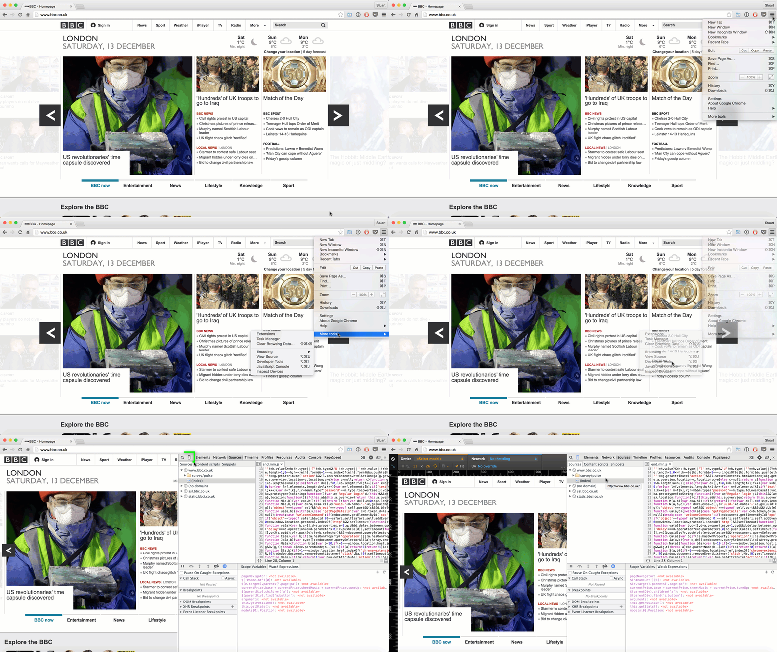
We will probably have to reload our page now so that Chrome can properly lay things out now that we’re in the new Device Mode.
From here we can start experimenting with the emulation options available to us. We will explore each of these options below.
Emulating Specific Devices
It is dead simple to configure Chrome to display your website as it would on a specific device. Dev Tools comes with over 40 preconfigured profiles for a range of popular devices, over and above this you can create your own profiles for other devices that you are interested in.
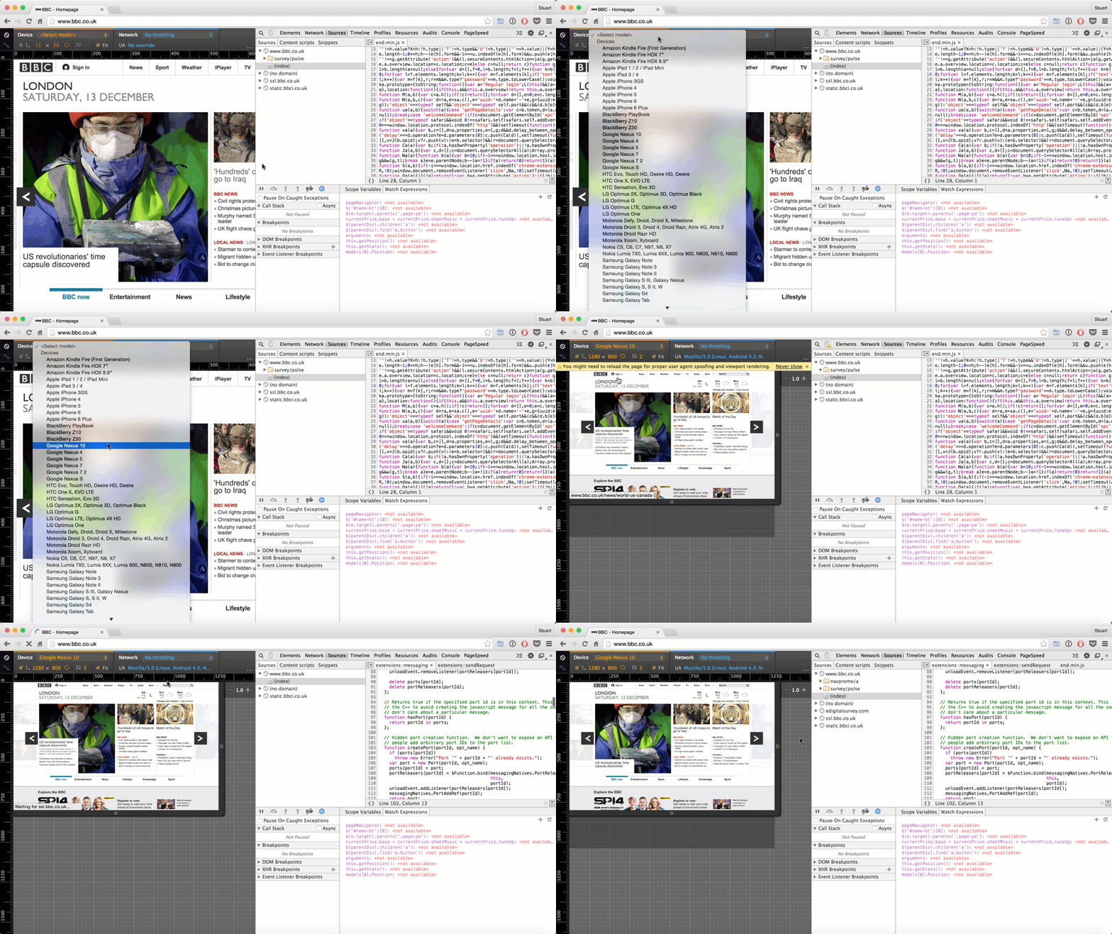
Above the rendered web page you will see a dropdown list labeled Device. From here you can select the desired device, for example Google Nexus 10, and the inner viewport will be resized to the correct dimensions. You will then be warned to refresh the browser so complete user-agent spoofing can be done.
Emulating Display Sizes
Despite there being a large range of preconfigured device profiles we can manually manipulate the emulated device’s size extremely easily. The webpage viewport can be dragged to the desired size by clicking and dragging the borders to your desired size. As you drag the viewport you will see the page re-arrange based on any media queries that are present.
If you know exactly what size you want to view your page on you can enter the height and width in the text boxes below the Device dropdown. If you want to toggle quickly between the ‘portrait’ and ‘landscape’ equivalents of these dimensions, simply click the rotate button.
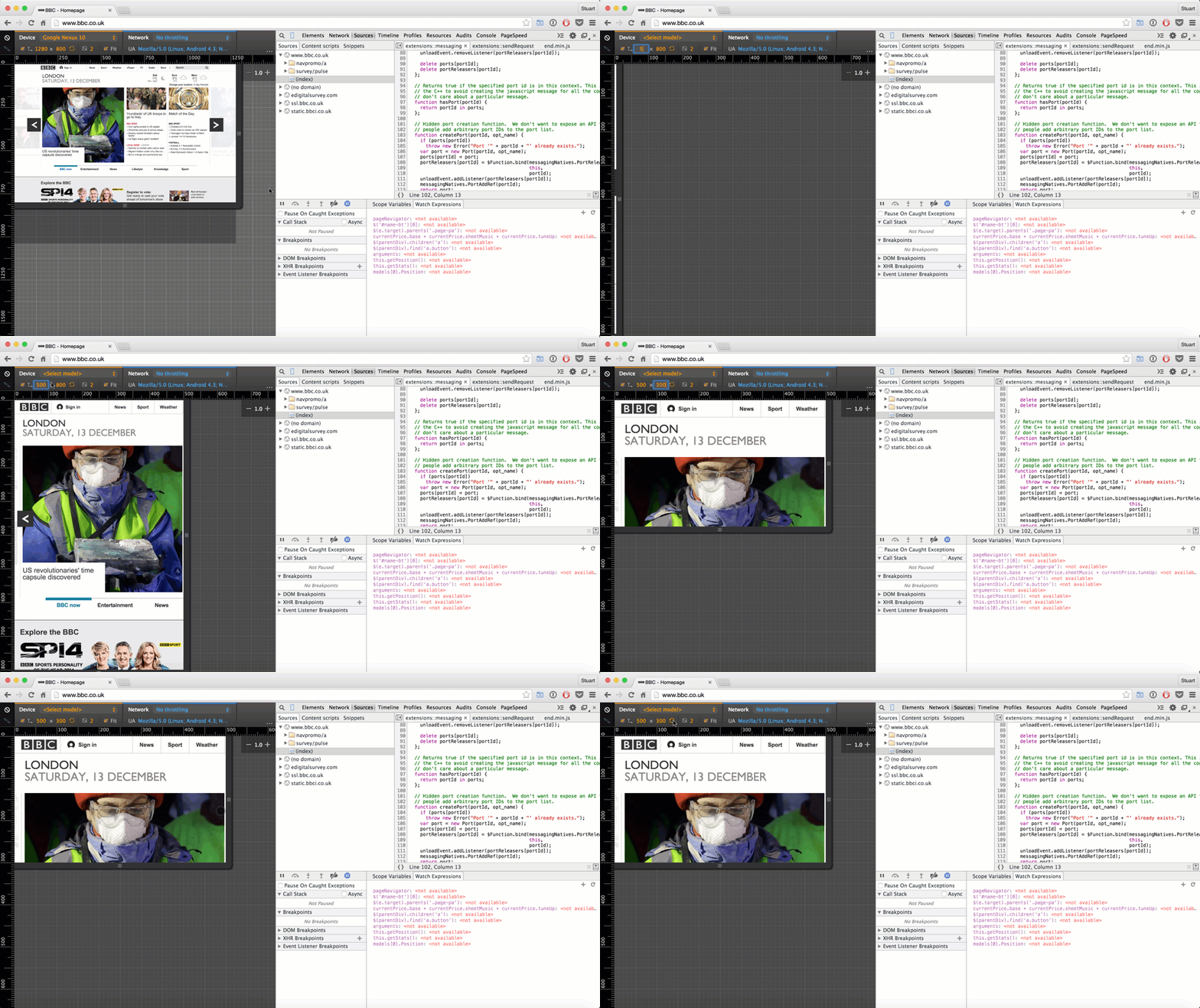
In addition to this you can specify the pixel density you want to view your page at so you can see how things look on retina and non-retina displays.
![]()
Media Query Inspection
One of the most powerful features of Device Mode is the Media Query inspector which lets us easily visualise our media queries rulesets and when they come into affect.
To enable this, click the  icon at the top left of the viewport. This will open a ‘timeline’ of showing three bars representing media query rules and its ‘range’.
The blue bar represents media query rules with max-width definitions. The bar always originates at the left-most edge and has markers along its length at each break point.

The green bar shows queries with min-width and max-width rules and so the bar will have a start and end point (depending on what the rules are). These rules can overlap each other but are defined by subtle shading and highlighting to show where rules start and end.

Finally, the orange bar shows queries with only min-width definitions. This bar will always stretch to infinite and have its rule boundaries towards the left of the screen.

By hovering over each of these bars we can see the details of the exact range the rules represent. We can quickly jump to the screen size where these breakpoints come into effect by clicking the bar, making it easy to see what the screen looks with those rules in effect.
An additional useful feature is being able to jump to the source code that is defining that rule. By right-clicking the rule you want to inspect you will see a list of source code locations where that rule is defined. There could potentially be multiple places where the same rule is defined so this list will show them all.

You will also notice that the rules that are currently active, based on the current viewport size, are highlighted. Try dragging the viewport’s width and see the bars change as each one becomes active.
Emulating Network Speeds
Another exciting feature that has previously been very hard to emulate is that of network speed throttling. By and large we test our websites on our office or home super-fast broadband which blinds us to the actual performance of it on differing network connections.
We’ve all finished a website and run it through Google PageSpeed and found it to be absolutely monstrous in size then spent some time minifying all our code, optimising our images and compressing it down to a fraction of the weight. This is great, but this process is still very relative (it was 5mb now it’s 2mb - good job!) but how does that actually translate to a mobile device on an Edge connection?
We can choose the network speed w want to emulate by using the dropdown labelled Network located beside the Device options. Within this list we can choose six levels of connectivity:
- WiFi (30Mbps with 2ms Round-Trip-Time or RTT)
- DSL (2Mbps with 5ms RTT)
- 3G (750Kbps with 100ms RTT)
- EDGE (250Kbps with 300ms RTT)
- GPRS (50Kbps with 500ms RTT)
Alternatively we can select Offline which will simulate the device being offline (no more turning off our WiFi!) so you can easily test your offline-first design.
Once you’ve chosen your level of throttling reload the page and you will see how your users feel when they’re out in the countryside on GPRS, waiting for your page to load.
You can now inspect the Network tab of Dev Tools and see how long things took to load and all the details of each request as if you were really on that connection.
Sensor Emulation
Unfortunately most laptops don’t come with accelerometers or GPS chips which makes testing all the new sensor-based APIs being made available to browsers a tricky task. It is a big win therefore to be able to simulate the data that they might provide our pages without having to load them onto real devices. Device Mode gives us the opportunity to simulate GPS and accelerometer data.
GPS Simulation
To access the GPS simulator we can hit ESC while focussed on Dev Tools or click the three dots to the right of the viewport’s Network section. In the tab that pops up in Dev Tools click the Emulation tab and then the Sensors item on the left.
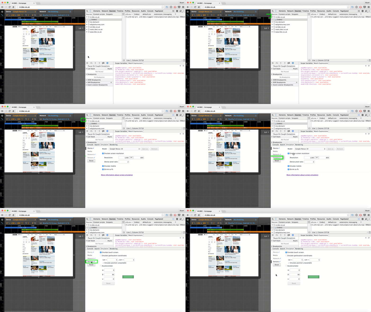
To activate the GPS simulation we can tick the box beside “Emulate geolocation coordinates” and then type in the Latitude and Longitude we want to feed into the webpage when it requests this data.
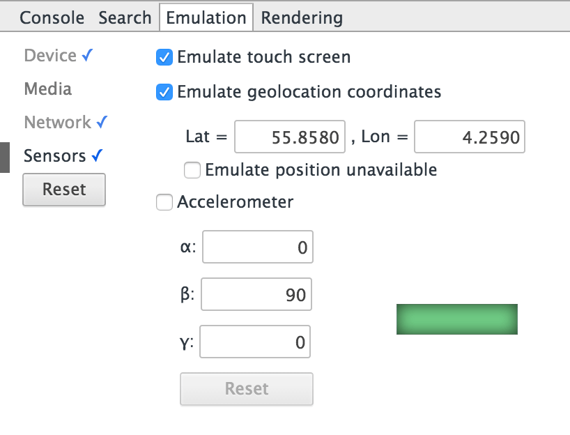
Acelerometer
In the same area of Dev Tools as the GPS emulation we can enable the Accelerometer by ticking the box. Now we can enter the desired rotation in the three boxes where it will be fed to the webpage as it is changed.
The first box (ALPHA) determines the rotation around the z-axis. The second (BETA) controls the rotation around the x-axis. Finally, the third (Y) controls the rotation around the y-axis.
After changing these values a 3D representation of them will be shown beside them allowing you to easily see what the numbers you are providing would look like in real-life.
If you want to try this simulation out I recommend going to this experiment and giving it a try: http://tctltntcl.ekrivoruchko.com/.
User Agent Spoofing
There are many reasons for inspecting user agents on the server and client and so being able to spoof what user-agent string is active is extremely useful. Device Mode’s tools lets you choose from a large list of popular browsers or customise what is used to suit.
Open up the Emulation screen (by hitting ESC in Dev Tools or clicking the three dots button, and then selecting the Emulation tab) and then choose the Network item. You can then tick the “Spoof user agent” box and choose your desired browser. Easy!
If you’re bored and want to know more about user-agents I recommend reading this article - History of the browser user-agent string - which is a humorous story of user-agent history and how the ridiculous combinations we see came to be.
Custom Configurations
We have a great deal of control over the aspects of the device emulation in Device Mode and it is very easy to save particular setups that we like.
Simply go to the Emulation screen and click the Save as button and enter a name. Your saved item will now appear under the Custom heading in the Device Models list where you can select it later.
What the future might bring?
Device Mode has brought emulation a long way and has made a lot of previously tedious and extremely difficult (or impossible!) tasks much easier to achieve. There are a lot of possibilities for future development of this area and I’m sure there are a bunch of ideas already cooking over at Google.
A couple of things I’d like to see would be (whether or not they are possible or not is a different matter!):
Throttling of rendering speed and performance
It would be brilliant to be able to emulate how the device actually renders and performs while running my websites and web apps. Its one thing to see how it looks at specific sizes etc but at the end of the day we’re still running this on a high-powered development machine, not an old Android device. This would be a huge feature.
Media Query Expansion
The media query explorer is a fantastic tool but I think it could be expanded to have similar setups for other rule types so these can be as easily visualised. For example, a similar bar setup for min-/max-heights would be great.